Calyx Health App is a clinic app. The goals are to streamline the app and amplify it visually so that seniors can more easily self-check-in at home and to make the app more interactive between Calyx Health Care Clinic and seniors.
About Calyx Health
Calyx Health is a care clinic that provides a better quality of healthcare system for seniors and allows them sufficient access and time with doctors and nurses.
Their primary care clinic was designed from the ground up to meet the needs of seniors. Their clinical team of internal medicine and geriatrics specialists are experts in the management of seniors, so seniors receive the highest quality geriatric care available.
They take a holistic approach to medicine that goes beyond just writing prescriptions. They take the extra time to understand senior goals, develop a care plan together, and keep them at their healthiest self.
My Role
I was assigned this mission in Sep 2018 for Calyx Health Care Clinic at Alameda, CA. My role was to research, design and consulting. I work with clients and design group on the execution and delivery of design deliverables.
Process and Approach
Business Goal
Calyx Health is able to sustain its business by providing quality care, access, and further knowledge of preventative care for geriatric medicare patients.
Project Goal
The main product goal is to streamline the app and amplify it visually so that seniors can more easily self-check-in at home and to make the app more interactive between receptionists and seniors.
The Unvalidated Problem
Streamline Flow
• Should be less time-consuming for receptionist, w/o sacrificing patient experience.
Check-in from home
• Hard when ¼ of patients don’t even use email... Integrate with myMedicare.gov
• Want interface for displaying and confirming imported records.
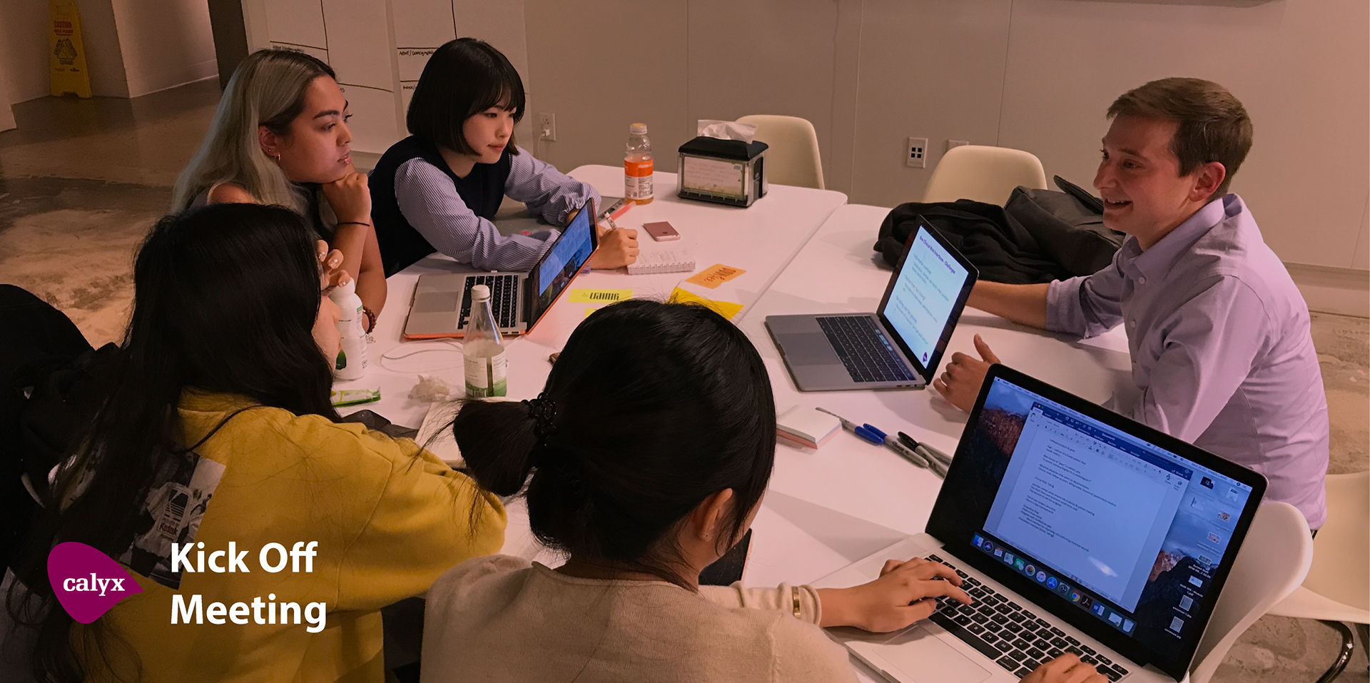
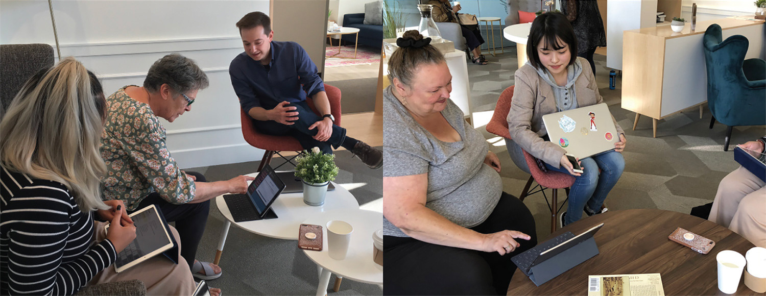
Meet the Users

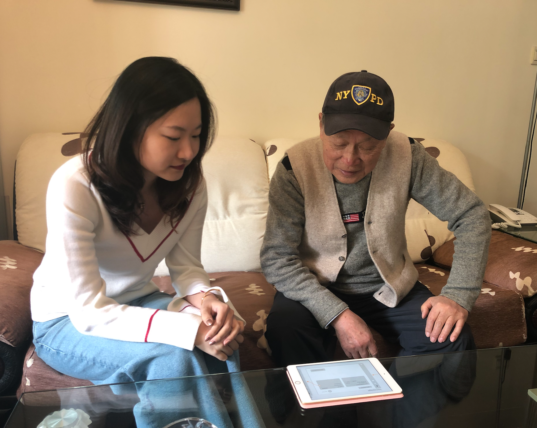
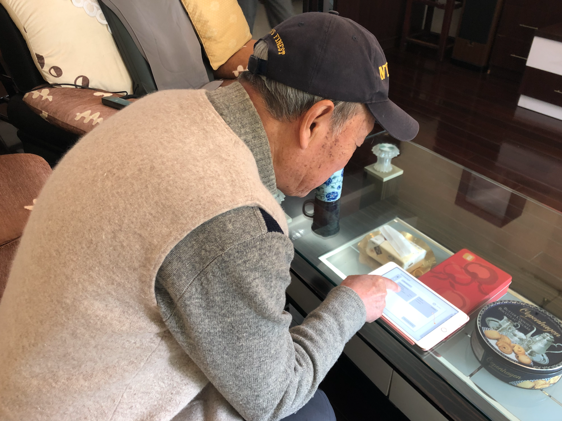
User Interviews
AND USER TESTING FOR THE CURRENT CALYX APP

The Learning Goals
Receptionist & Doctor
•What are common problems/pains the receptionist/doctor faces when inputting information?
•What is something that is more delightful for them when using the check-in app?
•What could make the experience better for them and their patient?
•How can the experience be more intuitive and efficient?
Seniors
•Observe seniors use Calyx check-in app.
•What kind of device seniors prefer to use?
•What their needs & pains in high tech?
•How can the high-tech experience be easier and more efficient to seniors?
Synthesis


Findings & Learnings
Seniors aren’t familiar with mobile tech. The Calyx Health App is difficult to understand and overwhelm patients. Seniors will use reminder for appointments.
Seniors are actually excited about tech and use it more than we assumed in their daily lives. Patients use the app easily, however, there are visual aspects we can improve. Patients love Calyx and the vibe of the Clinic.
The Validated Problem
Calyx wants their patients to use the check-in app on their own in and out of the Calyx clinic to gain the necessary information for the doctors, nurses, and receptionists. Currently, patients are assisted by one of the receptionists throughout the whole check-in process which takes time away from the other tasks receptionists have and there is no way to access the app outside of the clinic.
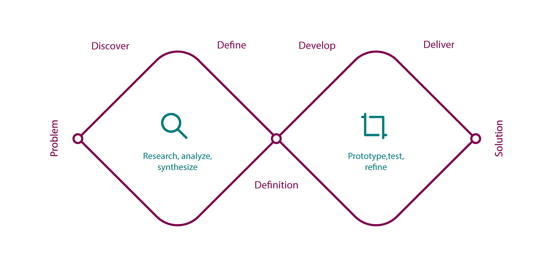
Find Design Solution

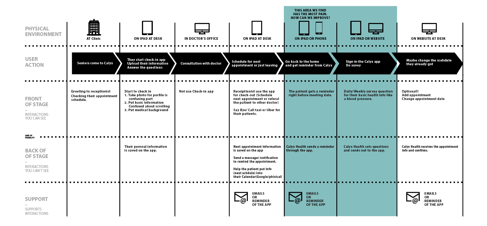
Customer Journey
CURRENT STATE GOAL: Seniors use the Calyx app at the Calyx Health office and home
From the content audit, we have a rough idea of how we are going to display the categories and contents in the nav bar and for every page. Second meeting with clients made us confirm the design of the site map as below. The cards highlighted in green were major changes that we made for app.
Site Map
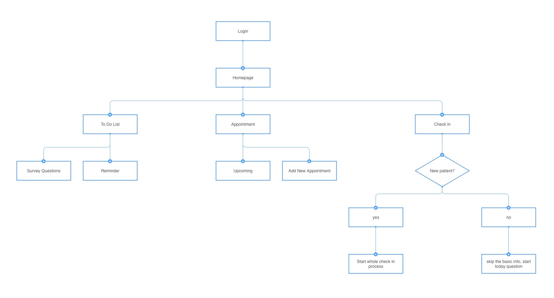
Key Features
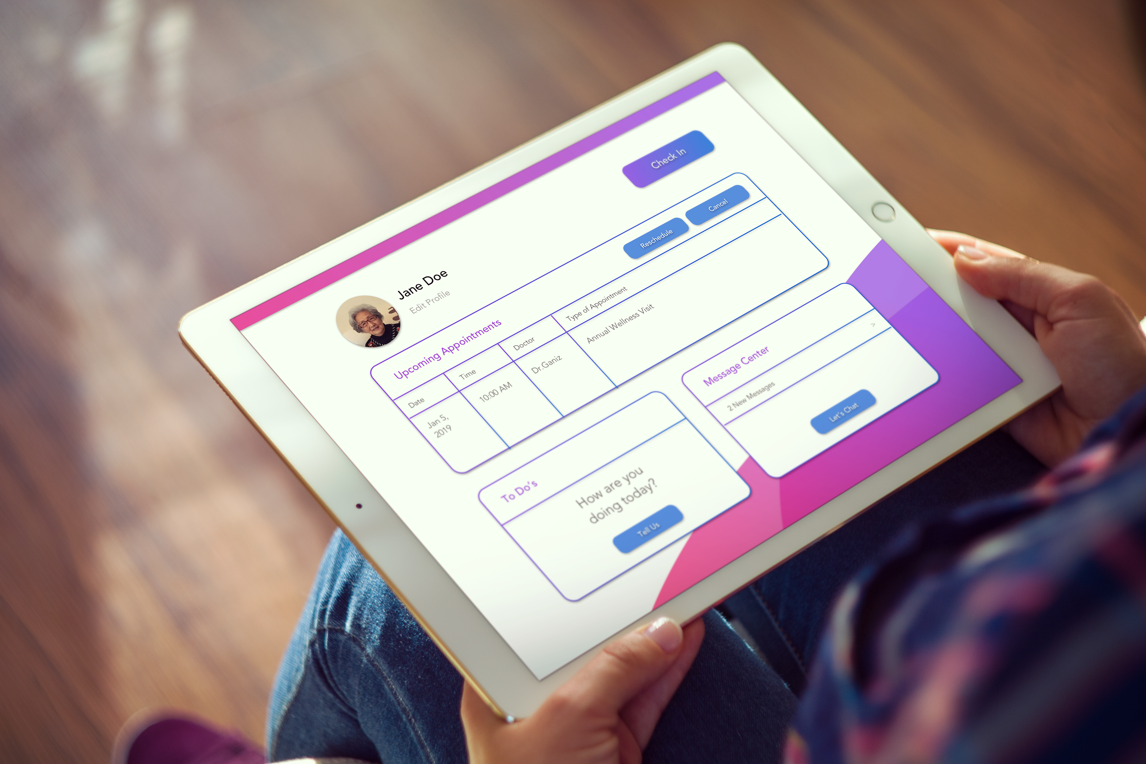
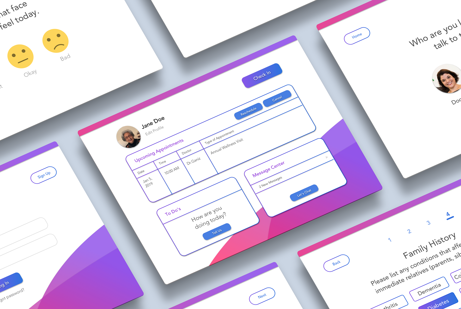
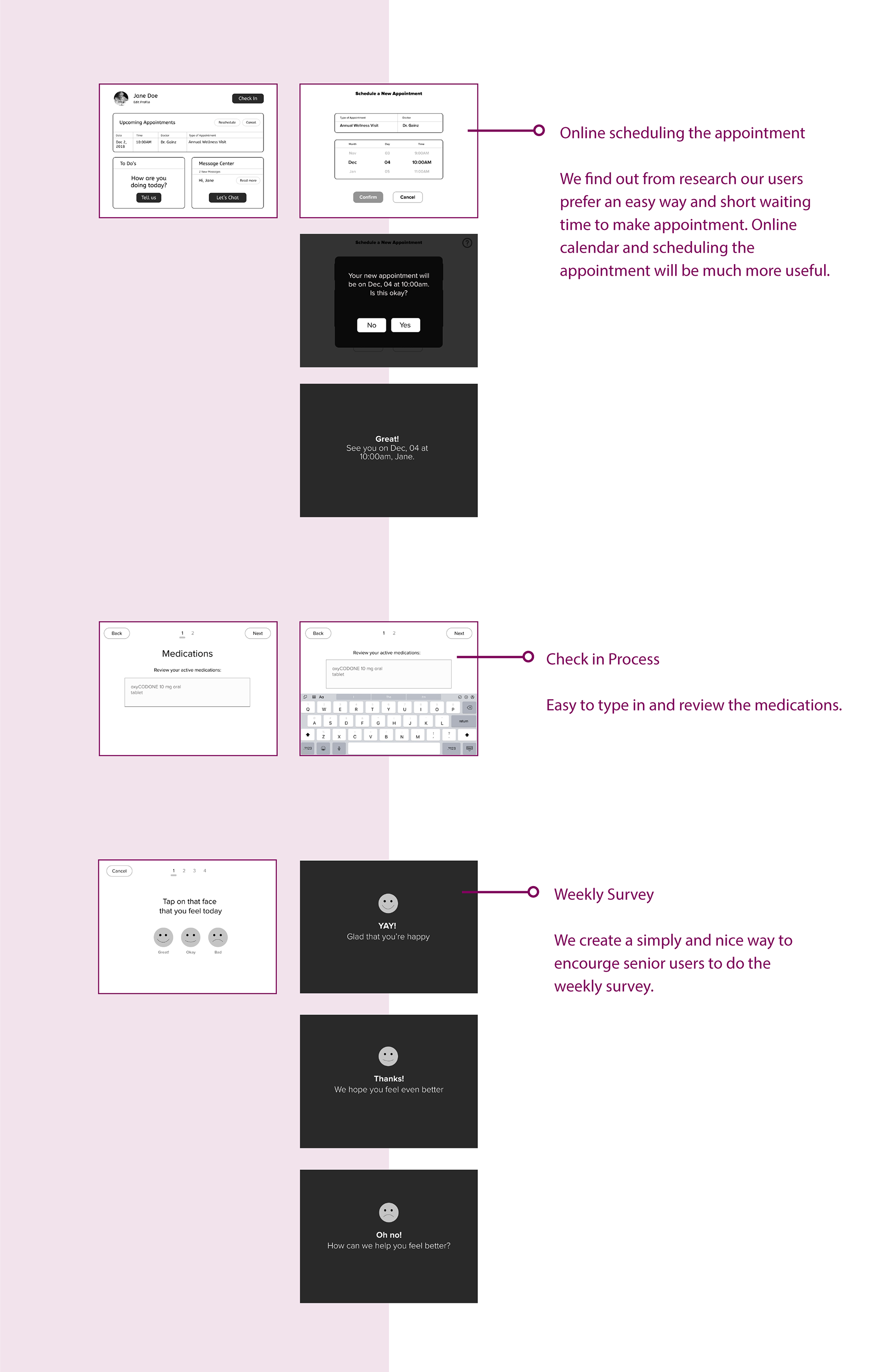
1. Easy Navigation
we created the top nav bar instead of the side nav, in this way to make it more comfortable to read. Moreover, it has easy reference point for users to be fully engaged with the contents; (Four categories Check-in, Appointments, To Do List, Message Center)
2. Check-in Service in Calyx Health Clinic
We implemented a check in button on the right of homepage to emphasize the business goal.
3. Reorganized Contents
We reorganized the contents for every page to make them more logical and user-friendly. Easy for users to read and find information.
4. Call Feature
In case seniors users are not familiar with this app, we designed the floating call button which will stick at the bottom right corner of sign in page to prioritize the user goal and easy for users to understand how to use this app.
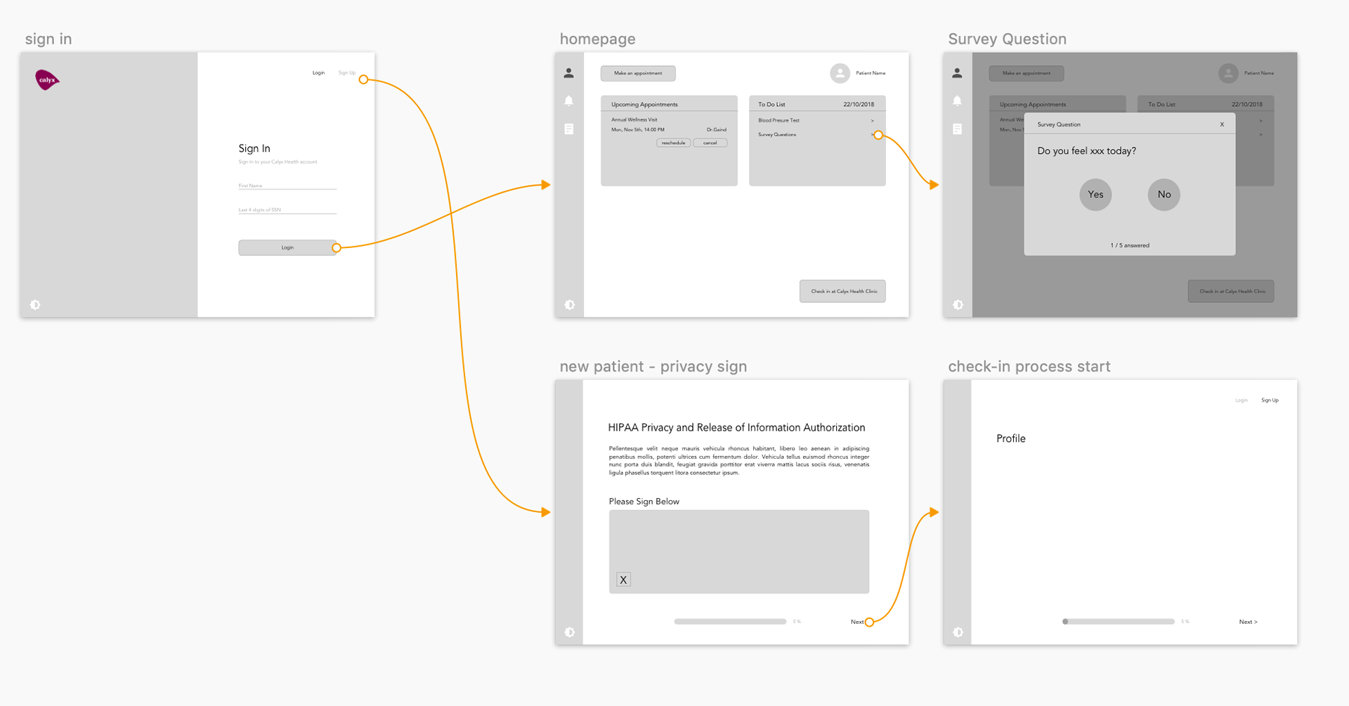
Wireframes
wireframe sketches
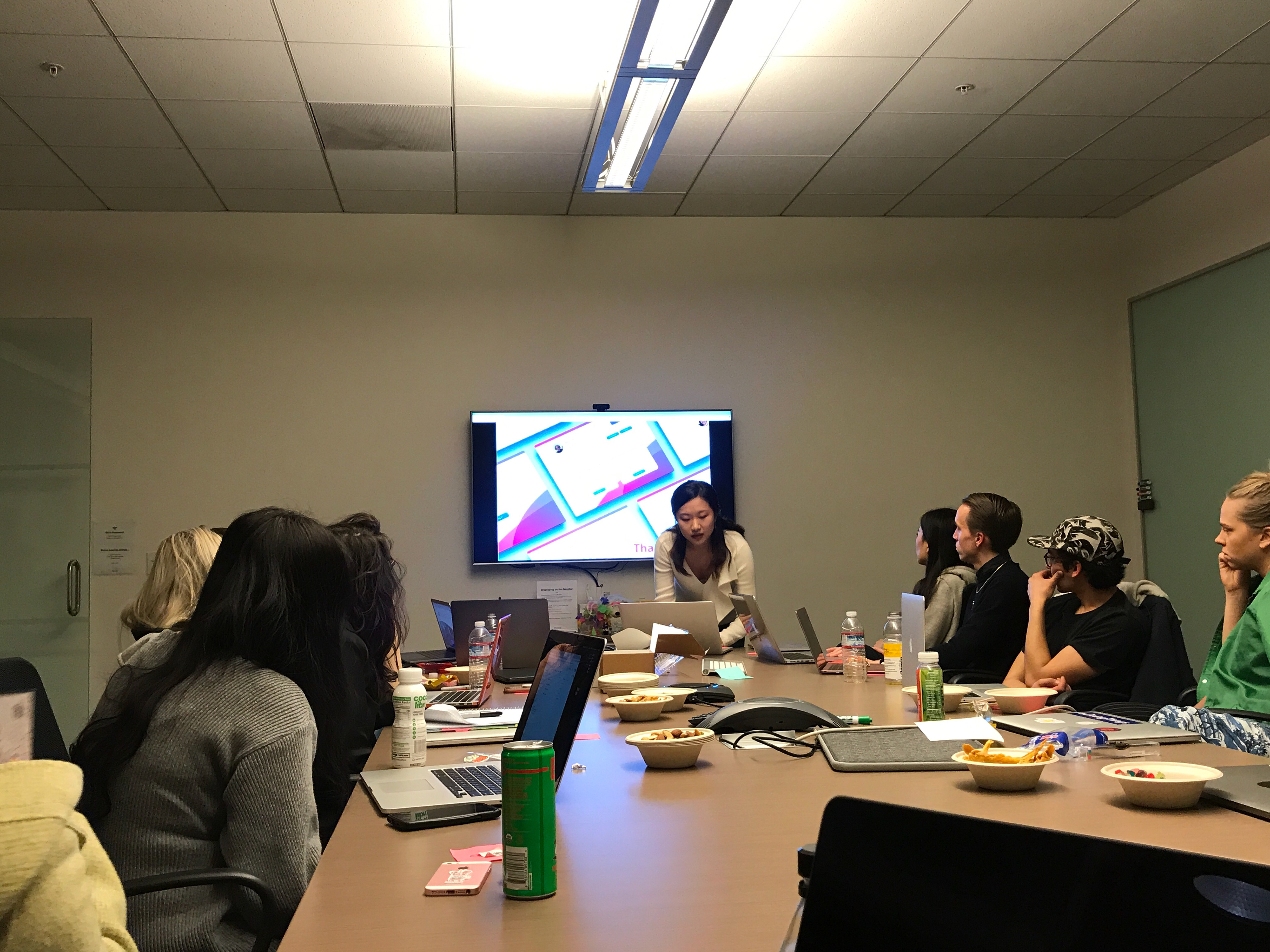
Usability Testing
Throughout the design process, we tested the prototypes with users. We incorporated feedback with each iteration. This led us to change the position of various buttons (e.g. the settings button on the navigation bar, which was originally accessible via the hamburger icon in the top right corner, and which was eventually moved to the user’s profile page).
Findings & Learnings
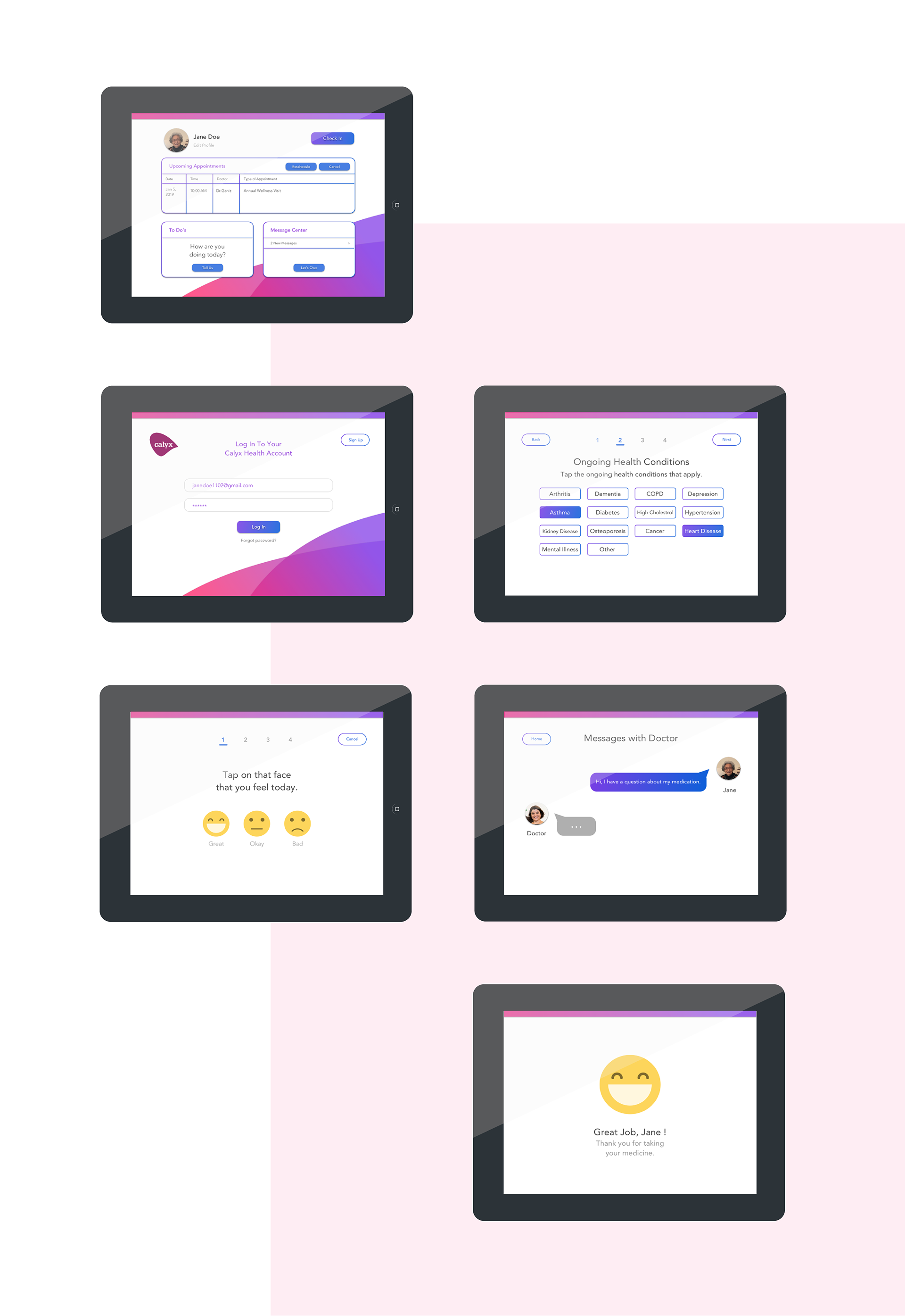
The essential issues to consider about UI design base on user testing result, going deeper into a convenient and functional visual presentation of the data in the app, were color palette and typography. As you can see, the designer made his choice in contrast color palette with the purple general background. And the main operative field of the app uses a white background which looks natural for the app in the health care sphere and serves several important goals:
– it supports the high level of readability, which is crucial for seniors user.
– it provides the great field of creating prominent contrast for key interaction elements, such as buttons or icons;
– it adds the space and air to the screen which is helpful to avoid the feeling of the screen overloaded with information and can hinder quick perception of core data fields.
updated wireframes
View full wireframes in Figma.
Visual Design
Final Presentation